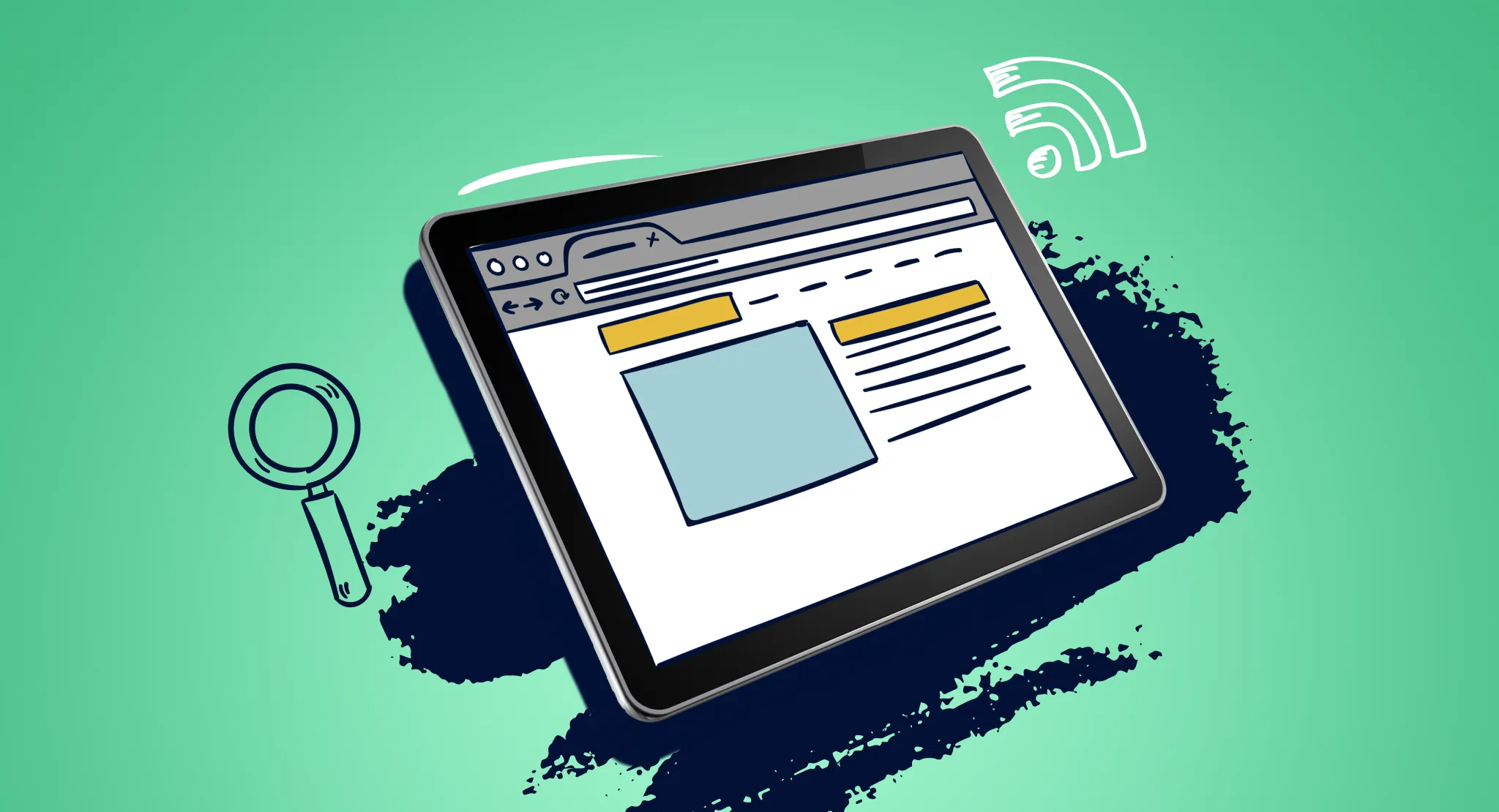
With digital platforms becoming major channels for advertising, self-promotion, and self-expression, creating and using web banners has never been more important. Web banners, also known as display ads, are digital ads placed on websites to drive traffic to an advertiser’s site. They can be manually placed or delivered through an ad network. These ads must meet certain requirements to make sure they display correctly.
For social media creators, small business owners, and bloggers, a web banner is often the customizable image at the top of profiles on LinkedIn, Twitter, Facebook, YouTube, Etsy, and personal websites. These banners, sometimes called cover photos or header photos, serve more for branding or introducing a section than encouraging clicks on an advertisement.
Here are some tips to help you create the best website banners.
Table of Contents
What Are the Main Elements of a Website Banner?
The key elements of a website banner include:
- The required size
- The background
- The headline
- The CTA (Call To Action)
- The product image or service showcase
Depending on your business type, you might add more elements, like sub-text. However, the elements listed above are essential for every banner.
Top Web Banner Design Tips
Here are some tips for creating the best website banners:
Choose Bold Color Gradients
Choosing bold color gradients is a modern design trend that boosts the visual impact of your banners. Blending contrasting colors adds depth, dimension, and a sense of motion.
Using a bold color gradient as a background makes your banners more dynamic and eye-catching. It grabs the viewer’s attention and gives a contemporary look.
Select colors that match your brand’s identity and message. This ensures consistency and effectively conveys the desired emotions or themes.
Try Different Layouts
Don’t feel stuck with the same old grid layout for banners. Mix things up. Try uneven (asymmetrical) designs, overlapping, or layouts that don’t follow a straight path. It can make your banner look fresh and interesting.
Asymmetry can help draw attention to the important things, and overlapping elements add a cool layered feel. A layout that doesn’t follow a straight line can guide someone’s eyes in a fun way. Just make sure whatever you try still fits your brand’s style.
Use Empty Space Smartly
Empty space (aka white space) isn’t wasted. It actually helps a lot. It makes things easier to read and keeps your banner from looking too crowded.
If you want something to pop, leave some space around it. It helps organize your design and makes the most important parts stand out more.
Have Fun with Fonts
Fonts can totally change how your banner feels. Try using a unique font or mixing different styles to keep things interesting. Want something casual? Go with a handwritten font. Want contrast? Mix a fancy serif font with a modern sans-serif one.
Play around with size, color, and boldness to show what’s most important. You can even lay text over images or make the font part of the design itself.
Add 3D or Illustration Effects
Want your banner to really pop? Try adding 3D elements or fun illustrations. These can make your visuals feel more real and grab more attention.
A 3D view of your product that people can zoom in on or cute animations that help tell a story would be great. You can even use lighting and shadows to make things feel more lifelike and engaging.
Use Micro-Interactions for Engagement
Micro-interactions, such as button animations, progress indicators, and hover effects, are small but impactful design elements that enhance user interaction and experience.
A subtle animation when hovering over a button can make the site more user-friendly and engaging, encouraging further exploration or desired actions.
These micro-interactions not only improve visual appeal but also provide feedback, guide user actions, and create memorable moments that enhance the user journey.
Include User-Generated Content
Incorporating user-generated content (UGC) in your banners can greatly enhance authenticity, social proof, and engagement. UGC includes customer testimonials, reviews, photos, videos, or social media posts shared by your audience.
By featuring real experiences and feedback from users, UGC builds trust and credibility, showcasing genuine interactions with your brand.
Highlighting positive reviews or user-generated images of your products or services can resonate with potential customers, building trust and encouraging them to act.
Design for Dark Mode Compatibility
As dark mode interfaces become more popular, it’s important to design banners that look good and are readable in dark mode.
Choose color combinations that work well in both light and dark modes to ensure readability and contrast. Use lighter text on dark backgrounds and darker text on light backgrounds for clear legibility.
Incorporate soft gradients or subtle textures to add depth without losing clarity. Test your banners in dark mode to ensure they remain visually appealing and easy to see, providing a smooth experience for users who prefer this setting.
Prioritize Mobile-Friendly Designs
Making banners mobile-friendly means using responsive layouts, optimized content, and easy navigation.
Make sure your banners adapt to various screen sizes and orientations, maintaining readability and usability on mobile devices.
Apply mobile-first design principles, focusing on essential content and clear, easy-to-tap calls-to-action (CTAs).
Avoid cluttered designs and large file sizes that can slow down loading times on mobile. Test your banners on different devices and browsers to ensure a consistent, user-friendly experience, especially for mobile users.
Integrate Video Backgrounds
Adding video backgrounds to your banners makes them way more eye-catching. It helps grab people’s attention and gets your message across better.
Choose high-quality videos that match your brand’s story or show your products/services in action.
A video background with product demos, customer testimonials, or behind-the-scenes clips can enhance storytelling and emotionally connect with viewers.
Ensure the video content is relevant, optimized for the web, and complements rather than distracts from your banner’s overall message.
Creating effective website banners is key to enhancing your online presence and engagement. Incorporate these expert tips to craft compelling website banners that captivate your audience, reinforce your brand message, and drive meaningful user engagement. Visit our website for more information.
For more similar blogs, visit EvolveDash today!
FAQs
- What’s the best size for a website banner?
It depends on where you’re using it, but a good size for desktop is 728×90 pixels, and for mobile, 320×50 works well.
- How can I make my banner look good on phones?
Go for a design that adjusts to different screen sizes. Keep things simple, make sure your text is easy to read, and buttons are big enough to tap.
- Can I add video to my banner?
Yeah, just make sure the video is clear, fits your message, and doesn’t slow down your site. And don’t let it take attention away from your call-to-action (like a “Shop Now” button).
- Can I use content made by my customers?
Totally! Sharing real reviews, photos, or testimonials from your customers can make your banner feel more real and trustworthy.
- How do I make sure my banner works in dark mode?
Use colors that pop, like light text on a dark background, and always double-check how it looks in dark mode so everything’s still easy to read and looks nice.