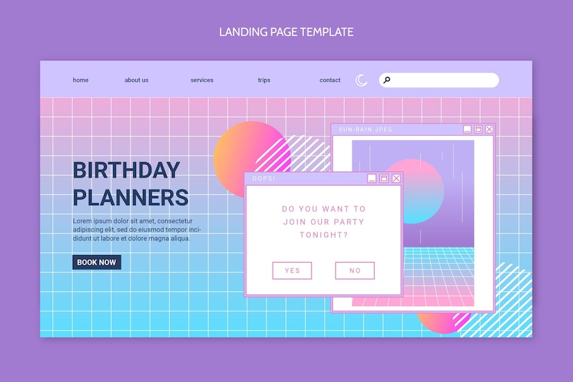
Deciding on the right layout for the website is crucial for its design. Whether you want your website to shine bright with a combination of vivid colors or add personality by using crisp fonts, the layout pumps brilliance into your website.
Serving as the foundation of your website, layouts can influence the user experience and affect the interactiveness of your website. From featured to asymmetrical designs, you can choose from many layouts that fit with your business persona.
In this article, we’ll discuss the 10 best website layout designs for a winning outlook and on-site experience.
Table of Contents
What Is a Website Layout?
A website layout is an arrangement of visual elements that defines a website’s structure. The role of a website layout is to present the information on a site, either for the website owner or the users, in the right format.
Performing as a key element of the website design, the layout determines the sequence. The intentional positioning of the elements helps create an impactful experience for users as well as for website owners. The layout consists of content that guides users around a website.
Simply put, a good website layout can lead site visitors’ focus in the proper direction. For example, visitors know what matters most and where they should move first to get the desired action done.
Moreover, the better the layout is, the better the performance of your website will be. So, before you jump into planning to build your website, ensure that your website layout resonates with and complements your overall business’s goals and target audience.
Best Practices For Choosing the Right Website Layout
It is important to know which website layout is ideal for your website. To get familiar with some basics, here are a bunch of layout concepts that’ll help in smooth navigation on your website.
Visual Weight
A few things on a website look heavier than others. This is known as visual weight. It is like comparing a big rock to a small pebble. Designers use this to guide your eyes to vital elements of the web page. Empty space around something can make it look heavier, like a spotlight. That is referred to as negative space.
Balanced Websites
A great website looks like everything is in the right place. It is like a balanced scale. All of the parts work and align well together. One way to balance a website is to make it look the same on both sides, like a mirror. This is called symmetry. It’s appealing to look at and makes the website feel calm and consistent.
Specific Audience Sections
Sometimes a website needs different areas for different people. It’s like having separate rooms in a house. Designers use the website’s look to sincerely show where one phase starts and another ends. This facilitates people finding what they want quickly and easily.
Breaking the Norms
Designers don’t always follow the same old rules. They can try new and creative things. It is like thinking outside the box. The most crucial element is to make the website easy to use and look good. A website must be both practical and pretty.
Grow Excitement For Your Website
Visual tension creates an element of drama in your web pages by directing viewers’ attention to specific elements. You can create visual tension in web design by deliberate use of contrasting colors, sizes, and asymmetry designed to highlight a specific part of the page.
In short, visuals can create interest and guide user focus in a way that feels dynamic and engaging rather than static or predictable.
Have Focal Points and Guide Your Visitors
A focal point acts like a magnet to your visitors’ eyes; it is the most important area on your website. It needs to be large, which means a big, bold headline, a great picture, or a shiny button. When you put something in the spotlight, people’s eyes automatically go to it.
Design With A Purpose
Before you plan to design your website, think about what you need it to offer. Do you need people to shop for something, learn about your business, or just enjoy searching on your website? Your website design has a job to do. It should help people do what you need them to do. It’s like planning a party where you want to know who’s coming and what you need them to do.
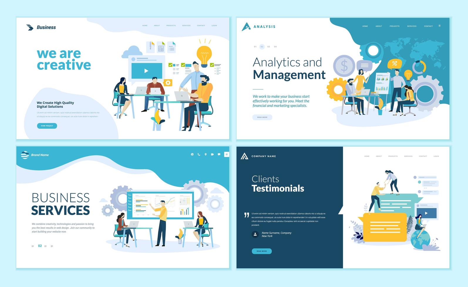
Best Website Layout Ideas
The choice of layout depends on the website’s purpose, target audience, and content. It’s essential to test different layouts to determine the most effective approach for your specific website.
Single-Column Layout
In a single-column layout, a website’s content is delivered to the device in one continuous vertical line. Because of its simple structure, navigation via scroll makes it easy to keep moving until the end of the page.
Single-column layouts are ideal for content-heavy websites like blogs, articles, or long-form guides where you must provide readers with a clean, uninterrupted reading experience. A single-column layout will function well at any display size, offering regular weekday reading across various devices—from desktops to smartphones.
Though it may appear simple, a clearly articulated hierarchy, along with good use of headings, subheadings, and white space, can increase visibility and create more engagement when using single-column layouts.
Z-Pattern Layout
Leveraging natural human eye movement, the Z-pattern layout guides users through a website in a diagonal pattern such as the letter “Z.” Starting from the top left corner, users tend to scan across to the top right, then down to the bottom left before completing at the lowest right.
By strategically putting key factors within those areas, you can create a visually engaging and effective layout. The top left is regularly reserved for the logo or website name, even as the top right is suitable for navigation menus or a creative CTA.
The diagonal route is ideal for showcasing hero images or compelling content, while the bottom left can accommodate additional calls to action or supplementary data.
F-Pattern Layout
The F-pattern affects text-rich websites, showing how users often test content. The F-pattern occurs when the eyes tend to move from the left to the right at the top of the page, representing the top bar of an F.
After that, the user’s eyes move down and trace the left side of the page, basically creating the vertical line of the F. It’s important that businesses place the most important information at the top so that users can focus.
If you want to help users read and scan similar to the F-pattern, use compelling visuals, headings, and short text that is located left-justified. Also consider breaking up large chunks of text with bullet points, numbered lists, or short paragraphs. When users scan, they are more likely to dig deeper into the content and are more likely to read the content if the scannability is improved!
Full-Screen Image Layout
A full-screen image layout dominates a website with a large image that fills the entire screen. This immersive design creates a strong, visible impact and sets the tone for the website. It is perfect for businesses or portfolios that want to showcase visually stunning products, services, or artwork.
But it’s important to make certain that the overlaid content is legible and complements the image’s atmosphere. This layout is mainly powerful on high-resolution displays and can be more desirable with subtle animations or interactive elements.
Grid Layout
A grid layout sets your content up in neatly structured rows and columns, resulting in a user-friendly and visually balanced page. The layout is versatile and highly robust, and not just online stores, but various website types can also incorporate a grid layout, such as portfolios, blogs, or even news sites. A grid layout creates balance in a web page by breaking up the content into like sections.
Grid layouts can be especially useful when presenting large amounts of information in an organized and digestible format. They can also be used to achieve a clear hierarchy through size and placement of grid areas. It can be easy to fall into a pattern of sameness, so don’t forget to include non-standard content with images, text, and video in the grid layout.
Split-Screen Layout
A split-screen layout is when one webpage is separated into equal (or unequal) sections; this can be an engaging type of visual layout. Split-screen layouts are effective when you want to compare and contrast data, show before-and-after visuals, or indicate related but separate content.
The two sections can include text, images, or videos, and the dividing line can be either vertical or horizontal. All sections should have different looks and feels, colors, and fonts that are complementary to create harmony in your design.
Asymmetrical Layout
An asymmetrical layout is different from traditional design. It balances the page by intentionally placing elements unevenly on the page to create an interesting and engaging visual layout that draws attention to certain areas. You can create focal points and shape the user’s eye flow through the web page.
Asymmetrical layouts are usually done for a modern or creative look but can also be used to highlight key information or even create a story. Even when the pieces are not arranged in a symmetrical way, you still want to create a sense of visual harmony and stability for the user.
Featured Image Layout
The featured image layout highlights a single, big image called a featured image. The image usually represents the main subject or content of the page, and it occupies a lot of real estate to grab the visitor’s attention like a good headline would.
Featured images are often used on blogs and portfolios. It creates a strong visual focus at the start of their web page, and it becomes the focus of the web page and sets the tone.
Headline and Thumbnails Gallery Layout
This layout incorporates images and text to create a beautiful and informative page. Very good headline text summarizing the content follows a gallery of smaller versions of the images. Each thumbnail guesses a topic or object, and clicking on it goes to a more detailed page.
This layout is suitable for websites that have a lot of visual content. It could be image portfolios, product catalogs, or even archived blogs. A quick scan of the page allows visitors to quickly assess what interests them.
Box-Based Layout
A box-based layout organizes content material into square boxes or modules. These boxes contain one particular type of content that includes an article, product, or image. This can help to invoke a tidy and organized look, allowing visitors to easily navigate their way through the page. This style is commonly used for blogs, online stores, and portfolio displays.
To maximize visual appeal, ensure that you consistently use space, typography, and color across each box. A featured field located at the top of the web page may work as a visual focal point and a summary of the site’s content.
Enhance the User Experience With the Right Website Layouts
If you want your website to be successful, it’s important to choose the appropriate layout. All layouts have pros and cons that dictate how web visitors will behave with your materials and information. While you are determining your preference, you should keep in mind your website’s purpose, audience, and content. It may also be worth it to experiment with diverse types of layouts in order to get some variety for your brand.
Are you looking for a website facelift? EvolveDash is dedicated to creating layouts that are not only visually stunning but also encourage browsing and increase conversion. We infuse technology with creativity to provide a captivating digital experience tailored for your brand.
You shouldn’t choose another generic website—work with us so we can create an engaging website that reflects your needs and values. Let EvolveDash breathe life into your website idea!
FAQs
- How do website layouts impact SEO?
Website layouts can affect SEO by influencing page load speed, mobile responsiveness, and where to place important content. Having a good layout will allow search engines to crawl/log the website in an easy manner.
- What are the main differences between fixed and fluid layouts?
A fixed layout has fixed dimensions that cannot adjust based upon screen size. A fluid layout will adjust dimensions based on the user’s device, which can improve accessibility across different screens.
- What is the importance of color theory in website layouts?
Color theory helps designers pick colors that go well together, which influence a user’s emotions and interactions. A good layout utilizes color schemes to improve visual stimulus and usability on a web page.


